A Quick Introduction by S. Louis King
The Saturday Night Slasher is a comic born out from many different sources. Now when I say sources I’m not just talking about the things that have influenced the story. Obviously first and foremost it comes from a love of comics. Also just as obvious is that it comes from a love of horror. However what may not be so obvious, and this is the most important one, is it comes from twenty plus years of friendship. From the very start of my and Ryan’s friendship it was our mutual desire to make comics that I think bonded us so strongly. Oddly enough back in those early days Ryan wanted to be an inker and I wanted to pencil. Somewhere down the line we switched places and I fell in love with inking while he with penciling. Regardless of the change the idea of collaborating was something we always talked about. Still, it wasn’t until after many, many years of Ryan championing the idea of self publishing that I finally agreed to try our hand at producing a comic. At first we did a few mini-comics that we handed out to professionals at conventions. That was followed by putting together a Kickstarter to print our first project The Abominations of Science (available now to purchase digitally on comixology.com). When that was done I got the idea to do a comic that would be in the vein of an 80’s style slasher movie set in modern day. As we developed The Saturday Night Slasher Ryan made lots of art (he still does actually) that didn’t have a place in the story. Whether it was character sketches or pin ups or conceptual work, there was a lot of material that Ryan produced that didn’t have someplace to be showcased. Also, as the person who inks and colors his work there isn’t much of Ryan’s original art being seen. So not wanting to be the only person to get to enjoy that work I put together this gallery showcasing those pieces (along with contributions from myself here and there). You’ll also get to see some of Ryan’s uninked pencils and pages from my script for those of you interested in our process. Lastly, this gallery will be updated as new work comes in. The idea is this gallery will be continually evolving. So check back often and see what’s new.
And now enough with the words. Forward on to the art!
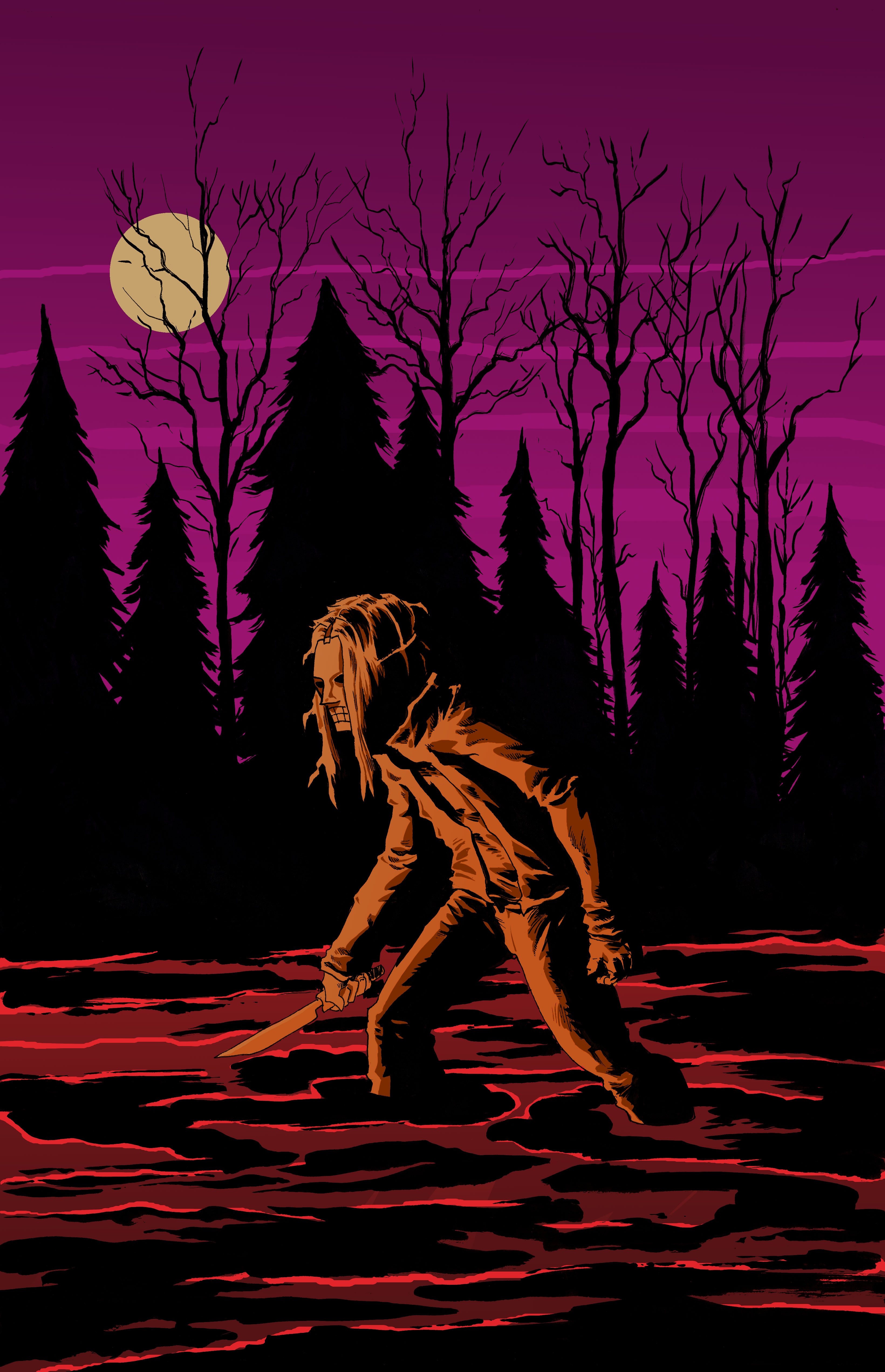
Another Saturday Night
Every once and a while Ryan will draw up a new slasher image that doesn’t fit into our story but demands to be seen. This is one of those images. There is also a definite Friday the 13th vibe to it. I love the visual of him slogging through the water. No doubt he is headed towards his next victim.
Look for a a print of this if you catch us at a convention this year.
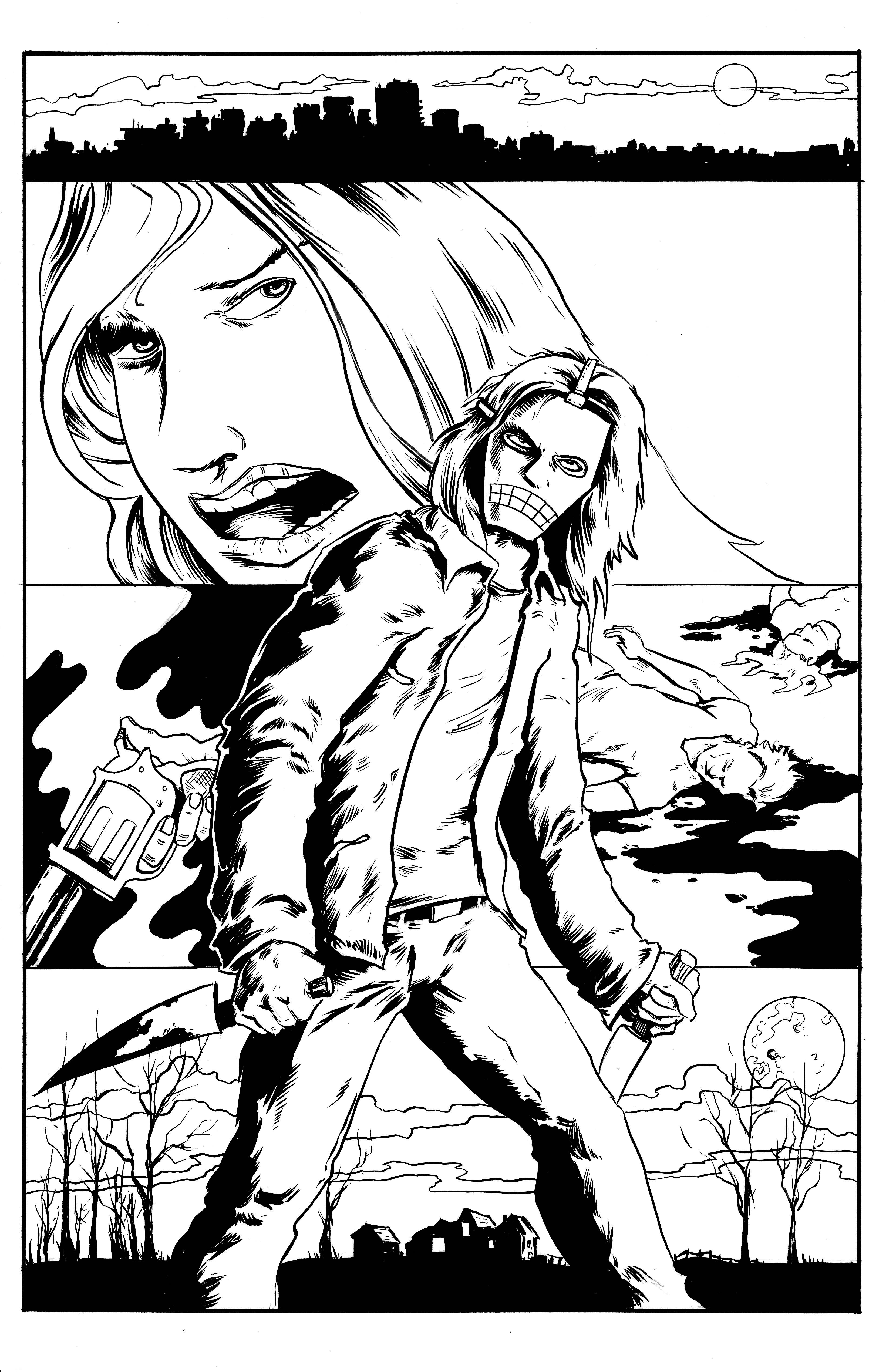
Slash in the City
This is another piece that Ryan drew and inked that isn’t for the story itself. This piece shows Ryan’s strong sense of composition as well as his inking skills. At some point we’ll see this in color. If you’re looking for clues as to where the story may be heading there are a few hidden in this piece.
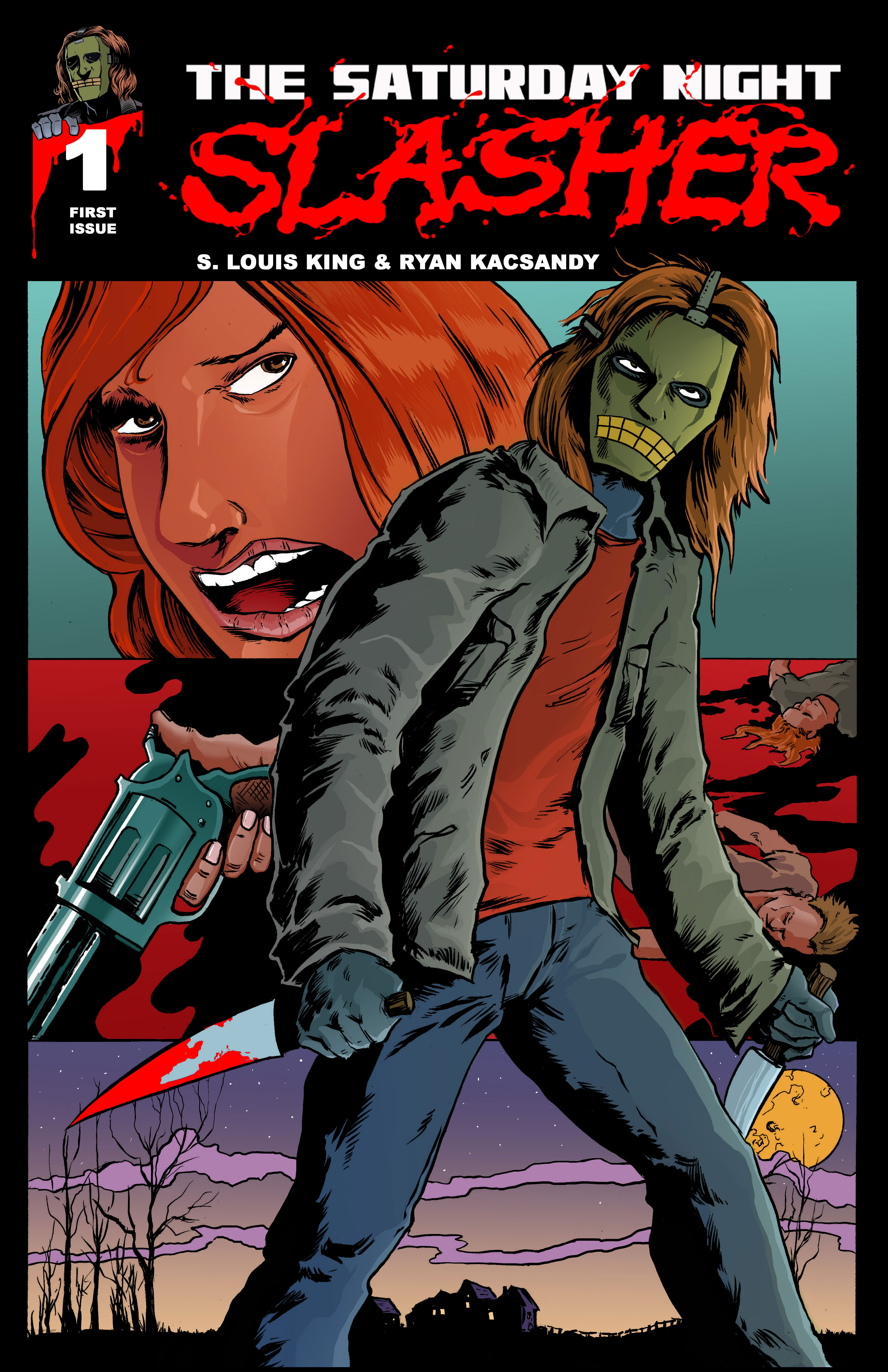
The Saturday Night Slasher #1
For the print version of the Saturday Night Slasher I decided to use Ryan’s “Slash in the City” piece. To make the piece work for the cover I had to alter Ryan’s work just a little bit. You’ll notice that the city was removed for the logo placement. If you look close enough you’ll also notice I increased the size of the slasher so he had a more prominent placement on the cover. There are also other small details added in the colors. I think overall it’s a strong cover. We hope you’ll agree as well.
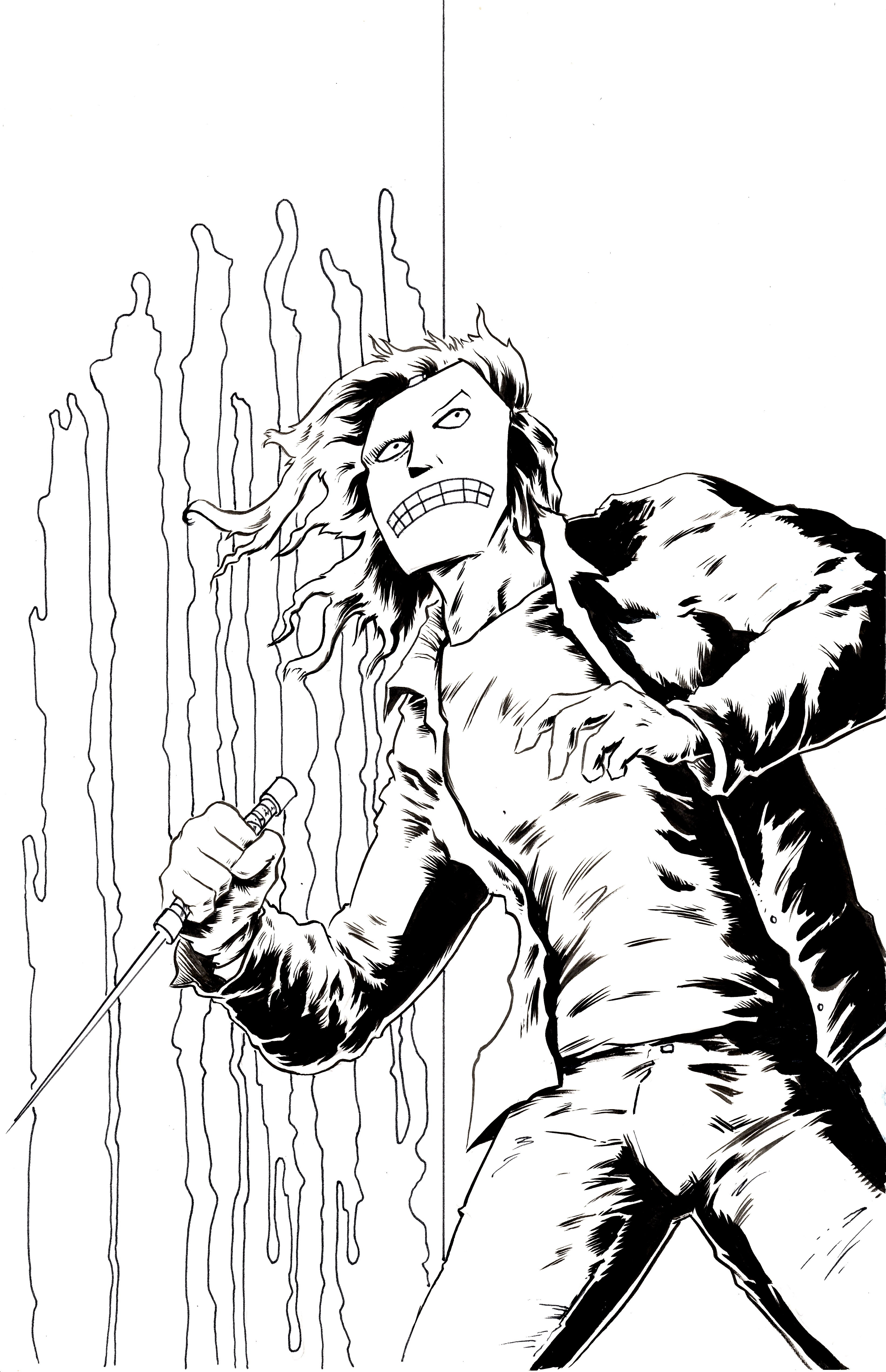
Slasher Bloody Slasher
Ryan penciled and inked this piece pretty early on when we were putting the comic together. It’s a striking image and this piece really got me excited to work on the story. This is another example of Ryan’s superior inking skills. As the person who has inked him more than anyone else I can say with all honesty that I think Ryan is his own best inker. There is an organic quality to his inks that I just can’t duplicate. The reality though is that I ink his pencils because it’s my favorite part of our process. I’m selfish like that.
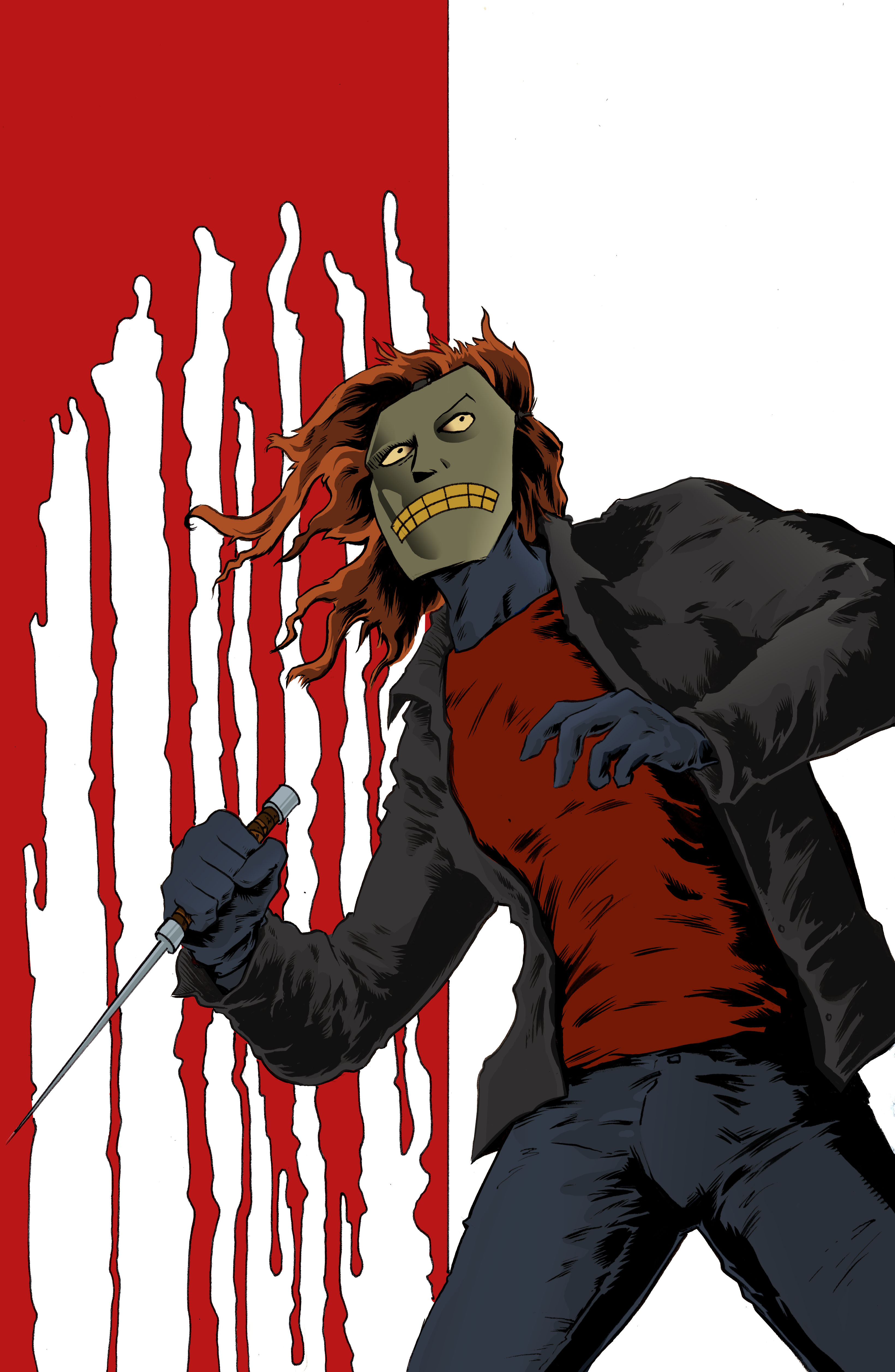
Slasher Bloody Slasher – Now in Color!
This is probably something that I shouldn’t admit but I don’t consider myself a colorist. To that end the coloring process is always changing for me as hopefully I get just a little bit better with every new piece. One of the things that is a constant struggle for me is keeping the colors from getting muddy. Most of the time the simplest solution is to check the K value in the CMYK breakdown of the color. The K in CMYK stands for black. Essentially the higher the K value the darker the color. When we had this piece printed for a convention the colors were very muddy. Seeing it in print was a real eyeopener because it was far more obvious than seeing in on a computer screen. At some point I’d like to tackle recoloring this one again and have it reprinted.
The Saturday Night Slasher Character Design
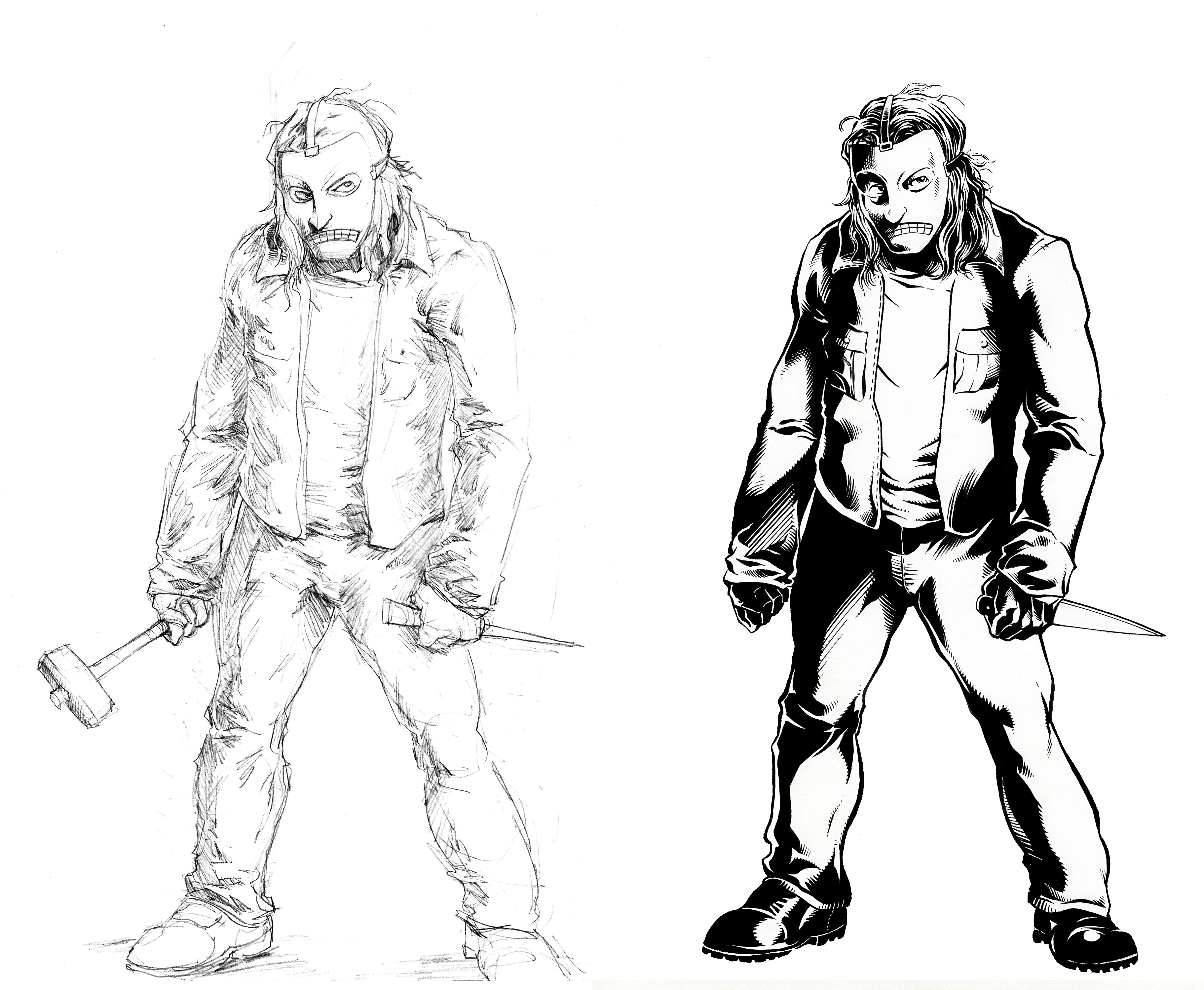
This is the first fully inked version of The Saturday Night Slasher. On the left are Ryan’s pencils and on the right is the inked version. You’ll notice Ryan originally drew a hammer and ice pick. The hammer was dropped and changed to a kitchen knife which is a staple of the genre. This was first drawing where I felt like he was visually a fully formed character.
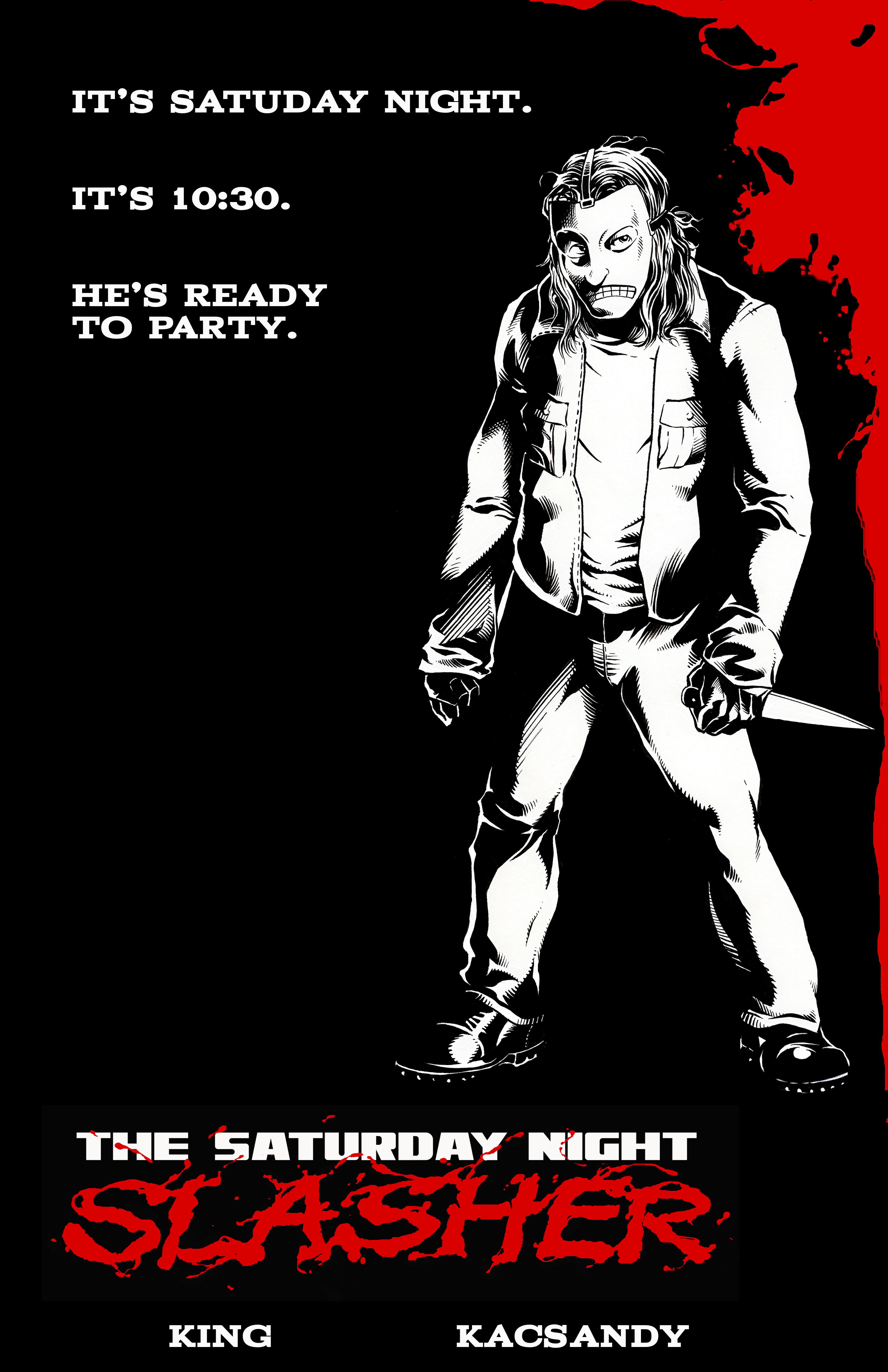
The First Promo We Released
The Saturday Night Slasher promo featured was printed and given away as postcards advertising the webcomic. We still use this image regularly and will continue to do so as it is the first image in which the slasher was completely realized. It’s also just because its a favorite of mine. I also often wonder if anyone gets that the copy on this promo is a reference to Wayne’s World. I’m certainly not subtle with it.
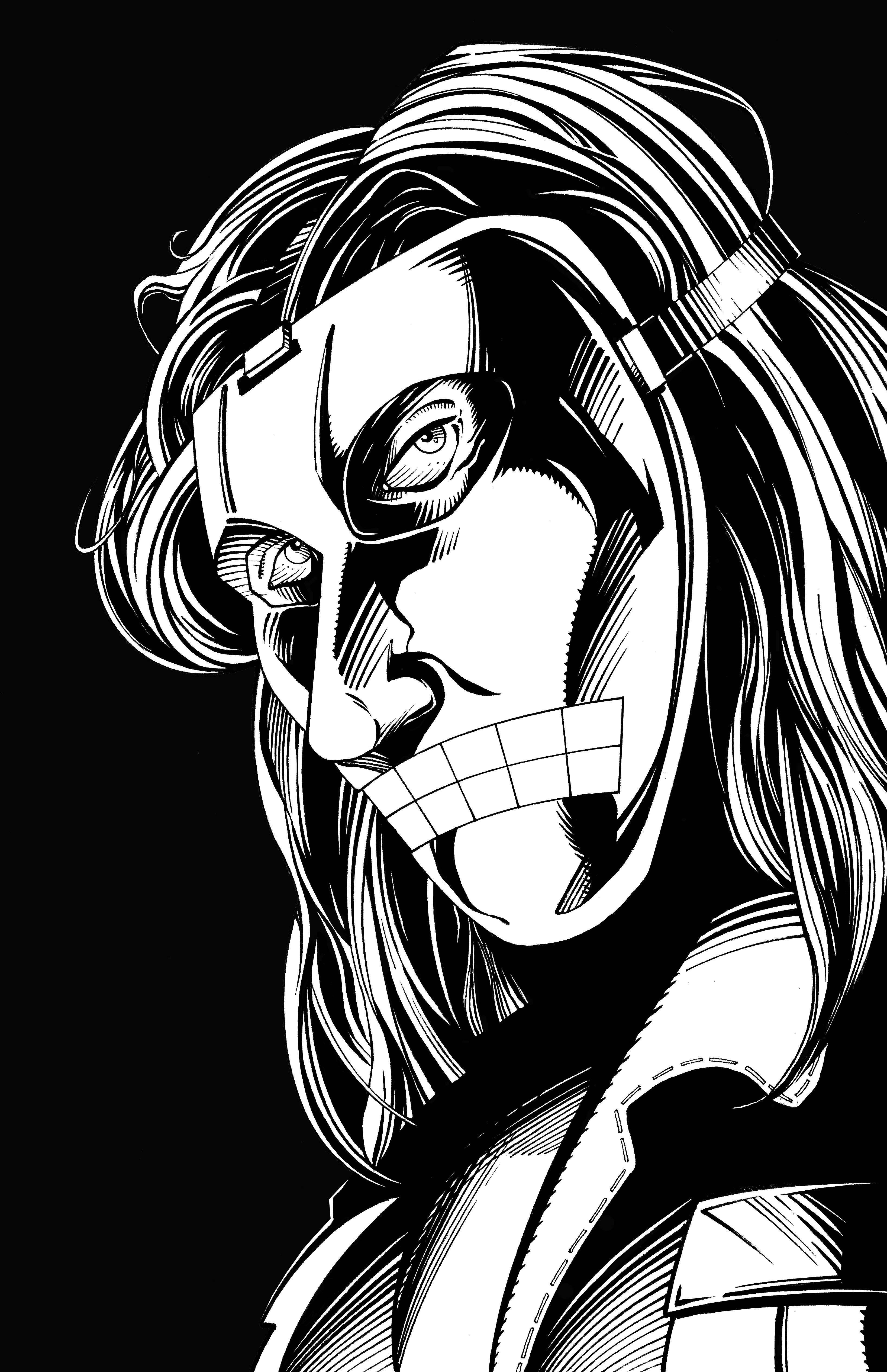
The Saturday Night Slasher Banner Image
Initially I had asked Ryan to draw a portrait of the Slasher in a 3/4’s head turn. Beyond that I wanted a dynamic image of the character that would look the viewers in the eye. It’s a simple idea but I wanted the character to engage anyone who encountered him. The practical thought was that we could use the image as a banner image. I also thought it was something we could have available as a print at conventions.
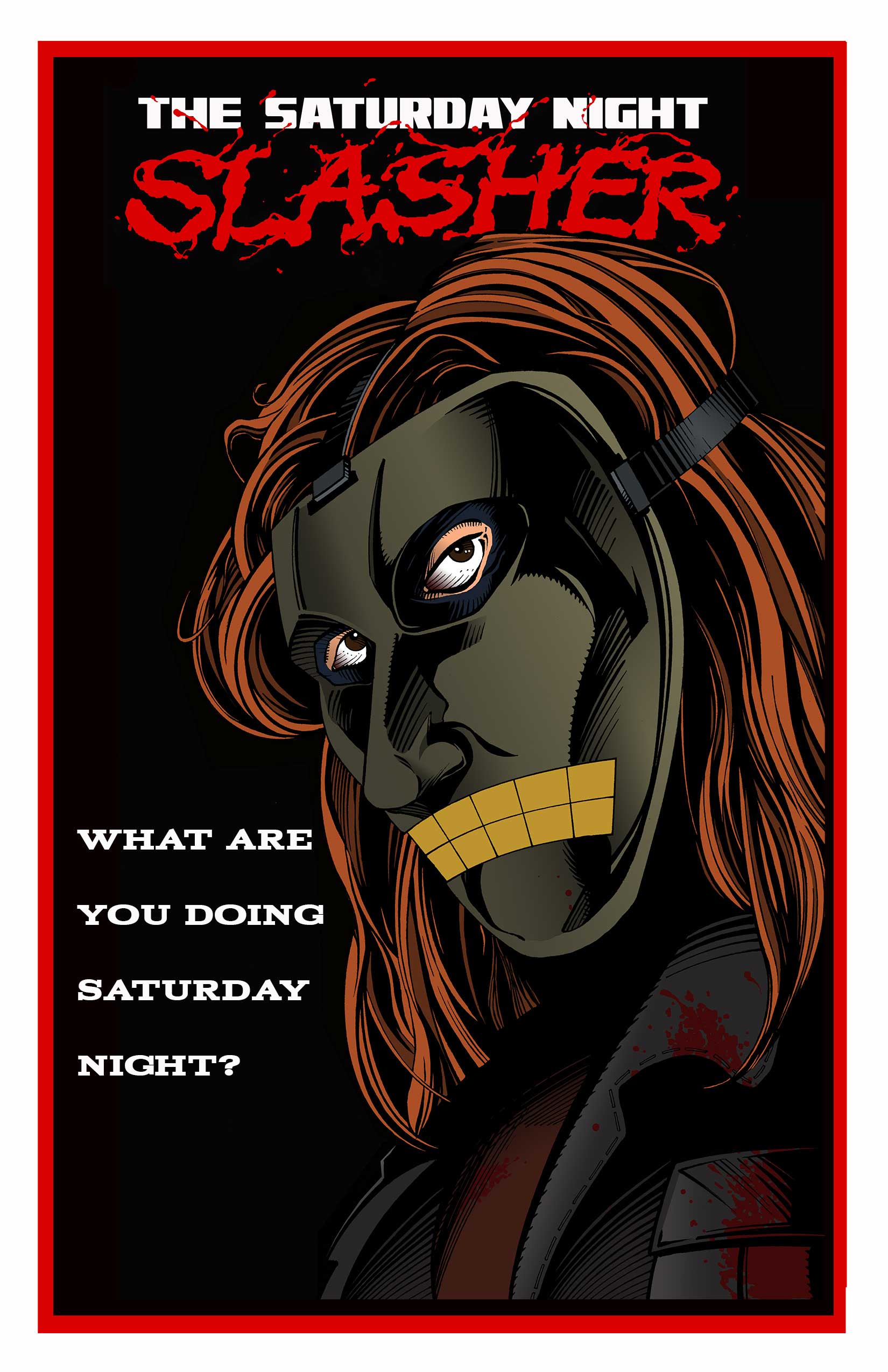
The Saturday Night Slasher Banner in Color
This is the color version of the the banner image. If you see us at a convention you’ll see a full 6 foot tall banner of this image behind us at our table. We also used a cropped version of this piece of just the Slasher’s eyes for the webcomic banner. This piece really became the face of the webcomic. We still use it regularly to promote the comic.
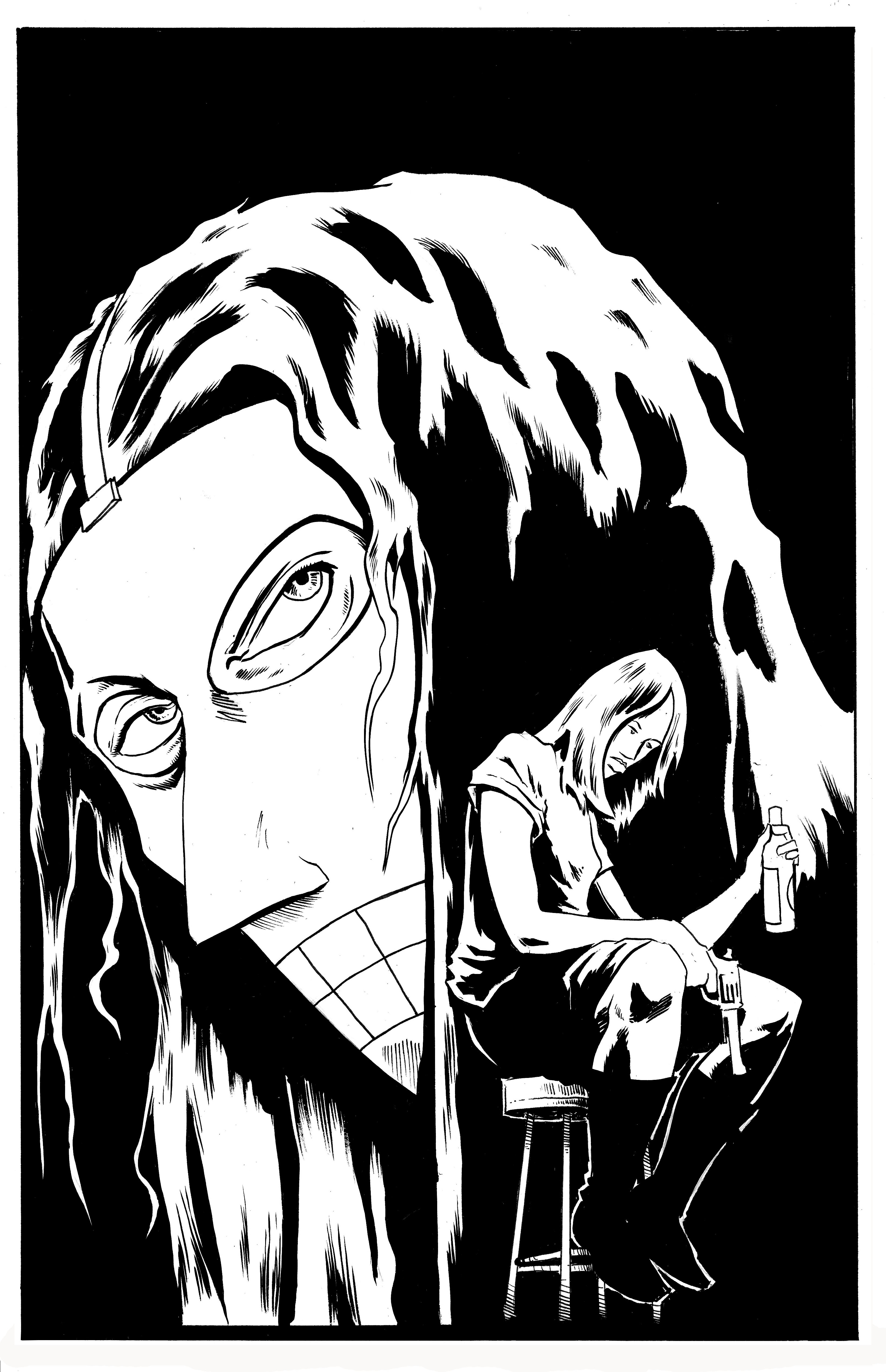
A first look At Julie Morrison
This I believe is the first image Ryan had given me of the Slasher that included Julie in the artwork. What’s most interesting here is that Julie is dressed in the outfit that she is wearing in her scenes taking place at Steiner’s Place. For each of the main characters in the story I gave Ryan a reference sheet for visuals to key off of. For Julie I had specifically put this outfit together as her “going out” outfit. I wanted Julie to be dressed uniquely for this scene. I feel her clothes should speak about her character just as much as anything else in her world. I still believe that and hopefully you’ll get more insight into Julie through her visuals the further we get in the story.
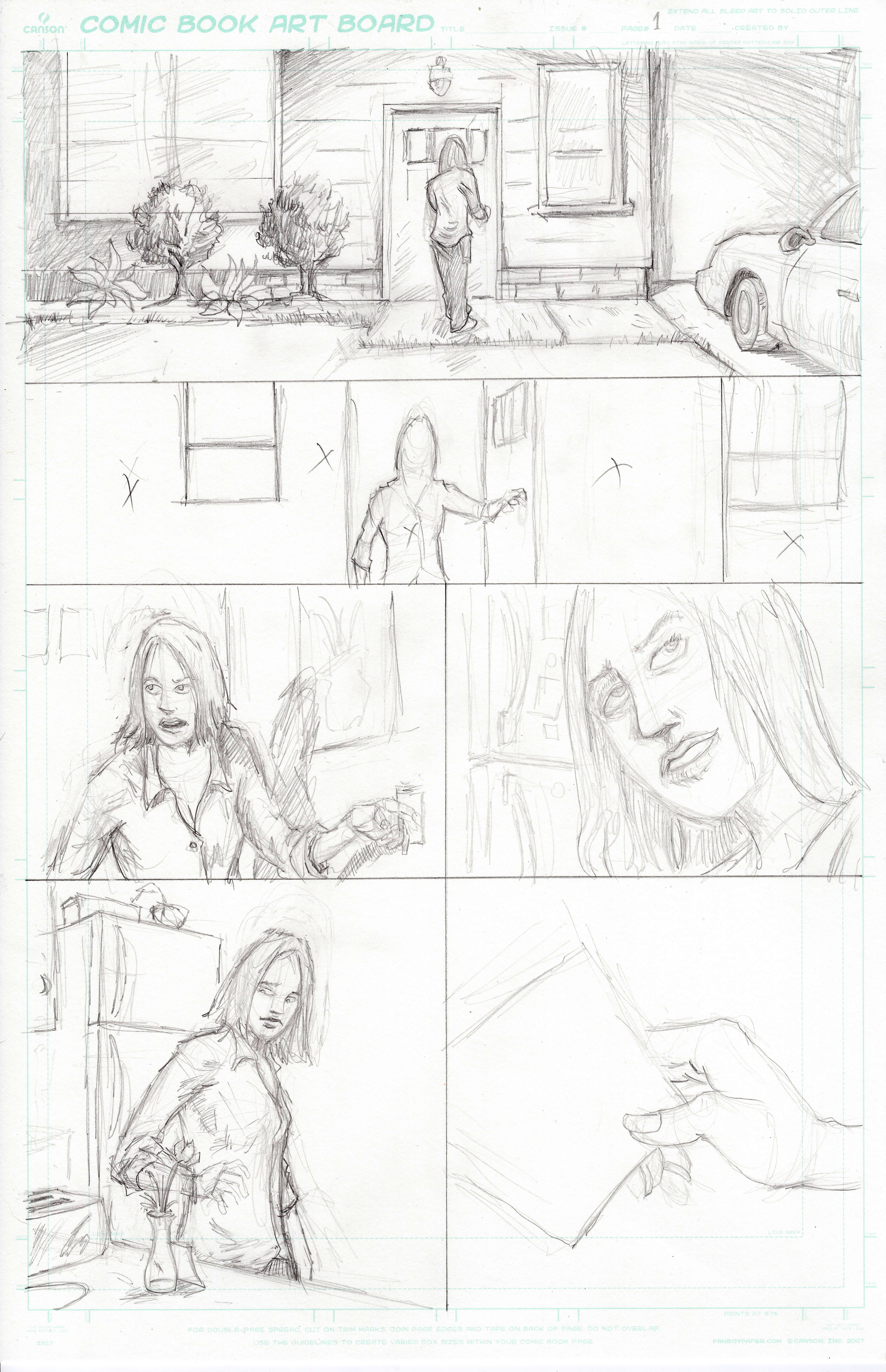
Ryan’s Pencils for the Pages 1-8
For those of you like me who are interested in the process of making a comic here are Ryan’s pencils for first eight pages of the comic along with my script. I’ve never written for someone other than Ryan so I’m not sure what another artist would make of my script. I try to be specific but also give Ryan room to be creative. I always tell him, “If you can make this work better than the way I wrote it then don’t hesitate to change it.” I also will give him page summaries so he knows what is happening on the page just in case it’s not clear from my panel descriptions. I don’t know if he likes that or not but Ryan is pretty easy to work with. He usually meets or exceeds what is written on the page. That said here are the first eight pages in their raw forms. I hope you enjoy them.
ONE
Note: I will start every page with a brief description of what happens from the first panel to the last. It will be listed as page summary and will then be followed by the panel descriptions and captions/dialogue. This will give you the opportunity as the artist to understand the scene but also fill in any holes that you may feel need addressing.
Page Summary: Six panels. A twenty something female comes home to a dark empty home. We see her turn on a light. She looks around for her boyfriend. She then finds a rose with a note attached to it in the kitchen. End of page. Each panel is part of a continuous move that starts outside the home and ends with her in the kitchen reading the note.
Panel 1: Exterior establishing shot of a suburban ranch style home with attached garage. It’s night; just shy of eleven o’clock actually. The lights are off inside the home. There are two exterior light sources, one on top of the garage, and one above the front door. In the driveway is a 2005 Chevy Cobalt.
CAPTION 1: Saturday, June 20th, 10:47 P.M.
CAPTION 2: The home of Deborah Green and James Lynch.
Panel 2: Interior establishing shot of the home – the living room – essentially the other side of the front door from panel 1. Deborah is in the doorway (almost framed by it if you will), and she has literally just walked in. It’s dark. She hasn’t even turned on the lights yet. The shot is in silhouette with the light source coming in from the outside of the house. Deborah is a physically fit 29 year old blonde caucasian female. She is a waitress and has come home early from work. Her attire is black pants, a white shirt, and a waist apron.
DEBORAH: Hello? Jim, you home?
Panel 3: Tighter on Deborah as she turns a light on. Her hand is on the wall switch. She is still checking to see if her boyfriend is home. Her expression is quizzical.
(Deborah in this panel is essentially between two rooms – the living room would be behind her, the kitchen is where she is going. It is not necessary to show an extraneous amount of detail but perhaps an indication that living room is now behind her. )
DEBORAH: Sweetie? Are you here?
DEBORAH: I text you an hour ago that I was coming home.
Panel 4: Still tight on Deborah who has continued into the kitchen. She is taking off the waist apron. She continues to talk to her boyfriend whom she would believe is off camera. To indicate where she is we will need to see the kitchen counter, microwave, sink, etc. We just need enough information to sell the geography of where she is in the home. The most important detail however is that on the counter is a rose in a thin vase with a note attached to it.
DEBORAH: It was slow at work so I came home early.
Panel 5: Deborah, same as panel 4, still in the kitchen, only now she has discovered the rose. Actually, she has bent over to smell the rose and she has the note in her hand.
DEBORAH: What is this? For me?
Panel 6: Close up of the note in Deborah’s hand. We can see the writing. It reads – Come upstairs. XOXO.
TWO
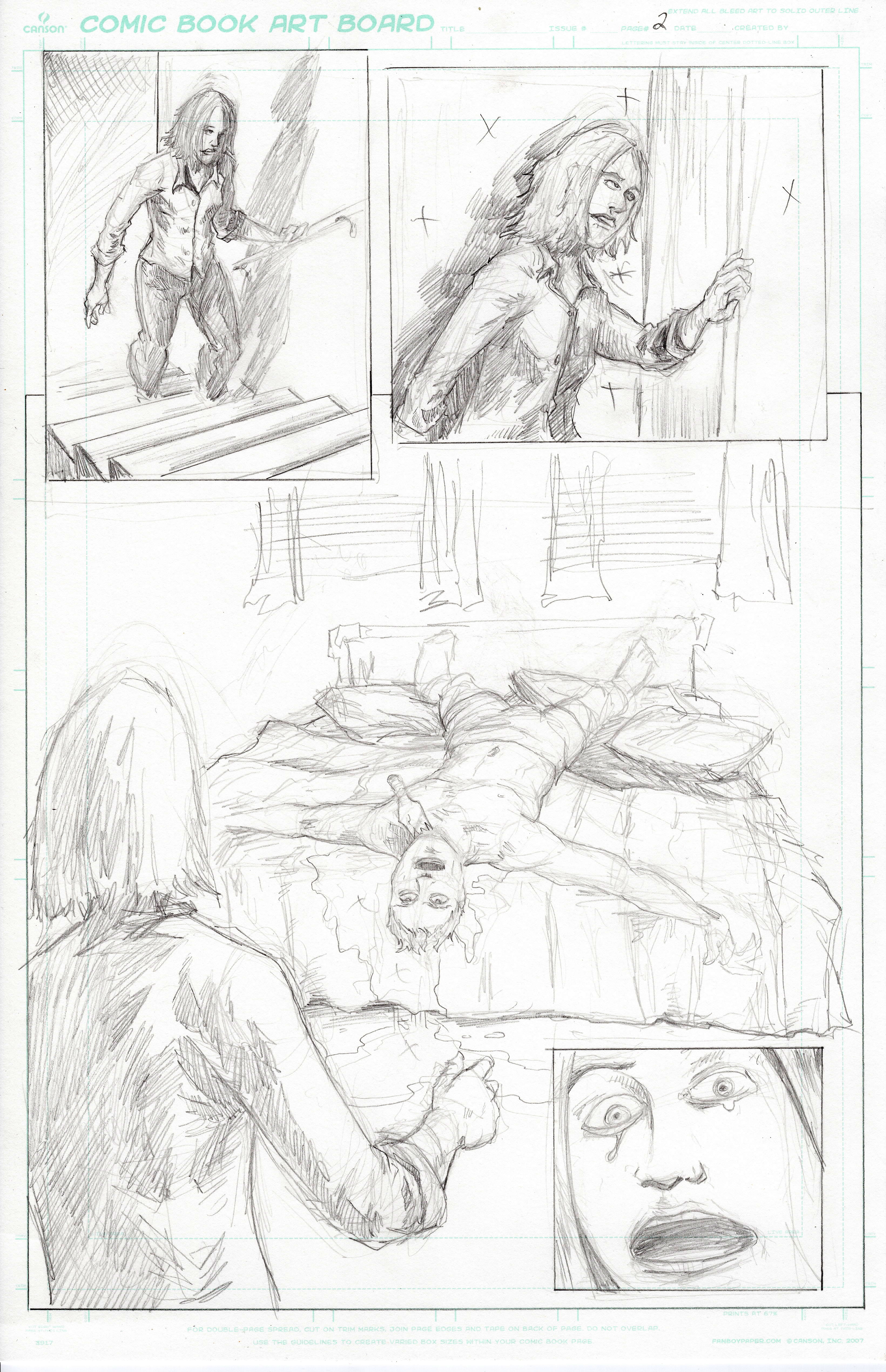
Page Summary: Four panels. Deborah walks up stairs to find her boyfriend Jim has been horrifically murdered in their bedroom.
Panel 1: Medium shot of Deborah coming up the stairs from a birds eye view perspective. Or rather the viewpoint of someone at the top of the stairs looking down at her. She is about a little more than half way up the steps. The rose is in her hand as she continues to talk to her boyfriend off camera.
DEBORAH: Y’know I get that you’re trying to be romantic here but you could have at least text me back.
Panel 2: Similar size panel as 1, still medium shot, only Deborah is up the stairs and is about to enter the bedroom. She has one hand on the door and is still conversational.
DEBORAH: The rose is a nice touch though. If you have a bottle of Merlot in there, you might just get…
Panel 3: Large panel, easily half the page or more, of the bedroom showing the terrible fate of Deborah’s boyfriend Jim. The shot perspective is over Deborah’s shoulder (You can choose how best to do this but she should be included in the panel). The couple’s king size bed is front and center of the bedroom. Jim’s lifeless body hangs off of it. His body is positioned upside down on the bed, with his neck and head dangling off the foot of the bed. More importantly, his throat is slit with a broken wine bottle shoved in his jugular. His arms are out in an almost christ like position. His eyes are wide open. He is dressed in only boxer shorts. Blood can be seen on his chest, neck, and pooling on the floor. Jim is 31 year old physically fit blonde caucasian male. He is about 6’ 2” and his corpse takes up most of the bed.
(When it comes to the blood, you can be vague in indicating it in the pencils. Its going to be decided how far to take it in the inks and colors. While there will be a lot of blood here I can tell you it won’t be painted on the walls kind of carnage. It will be more pooling on the floor and on the bed than anything else. Also, the bed and the body should be the central focus of the panel. If you need to force perspective to emphasize this I’m okay with that because of its importance.)
DEBORAH: lucky.
Panel 4: Close up of Deborah’s face screaming. Her mouth is wide open, as are her eyes. Tears have started to well up in the corners of her eyes. This is an extreme expression of terror – If this were the opening of a slasher flick this would be the scream queen shot. You can make this a bottom inset panel or a long horizontal panel below panel 3. However you want to lay it out is fine.
DEBORAH: AHHHHHHHHHHHHHH!!!!!!!!!!!!!!!!!!
THREE
Page Summary: Five panels. The Saturday Night Slasher is introduced. Deborah attacks the Slasher in fear for her life. Successful in her attack she escapes back down the stairs.
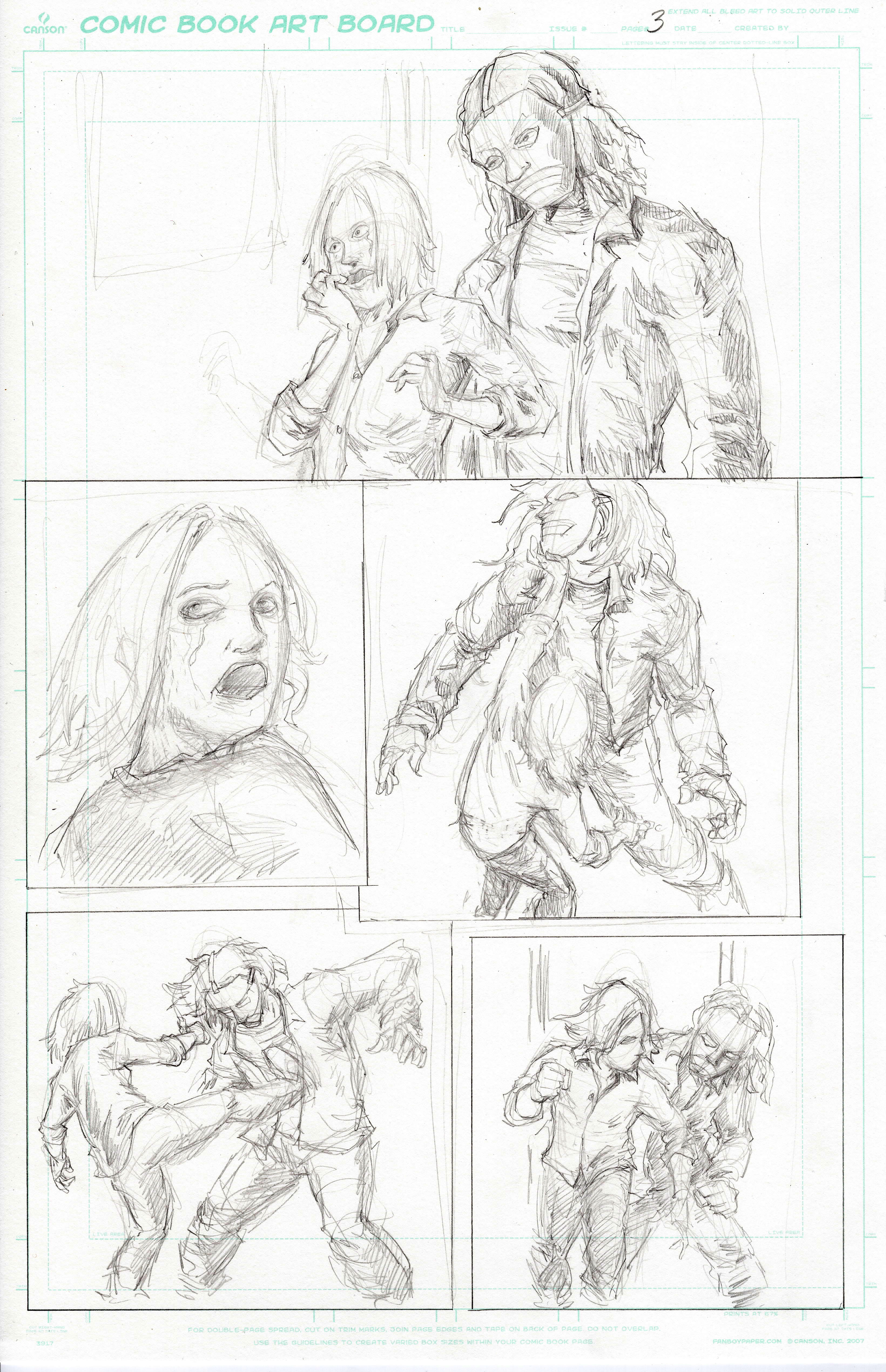
Panel 1: Large panel, maybe a third of the page, a continuation of the same moment as panel 4 of page 2, however the camera has pulled out from the close up of Deborah to reveal the Slasher is right behind her. The framing of the panel is from Deborah’s waist up. The Slasher should be at least a head or two taller than Deborah. Deborah’s expression is exactly the same as it was in the previous panel; mouth open, screaming her head off. She is unaware that the Slasher is behind her.
DEBORAH: AHHHHHHHHHHHHHH!!!!!!!!!!!!!!!!!!
Note: The actions in panel’s 2, 3, & 4 are almost instantaneous. I would actually liken the actions on the rest of the page to Jeanie’s discovery of Ed Rooney in the Bueller home in Ferris Bueller’s Day Off. I’m sure you remember, but she beats the hell out of Rooney and runs away. This is very similar. There is no dialogue here so if you want to add another panel to sell the action you can. Also I’m only giving stage direction here so you can compose the action and panel sizes.
Panel 2: Deborah has realized the Slasher is behind her. Her body is turned towards the Slasher and her head is tilted upwards to see his face (Well, mask anyways.) Tears are now rolling down her cheeks.
Panel 3: Deborah attacks and delivers a right hook under the bottom of the Slasher’s chin! The Slasher’s head is thrown back due more so to the location of the punch rather than its force. It is the type of punch that would make teeth chatter.
SFX: Crack!
Panel 4: Deborah kicks the Slasher square in the abdomen! The Slasher is knocked backwards.
SFX: Thud!
Panel 5: Deborah escapes the Slasher (albeit momentarily). Deborah is running full boar! She is coming directly at the camera. She should look almost as if she were coming right off the page and straight for the viewer! The Slasher is behind her but he is bent over recovering from the kick he took.
FOUR
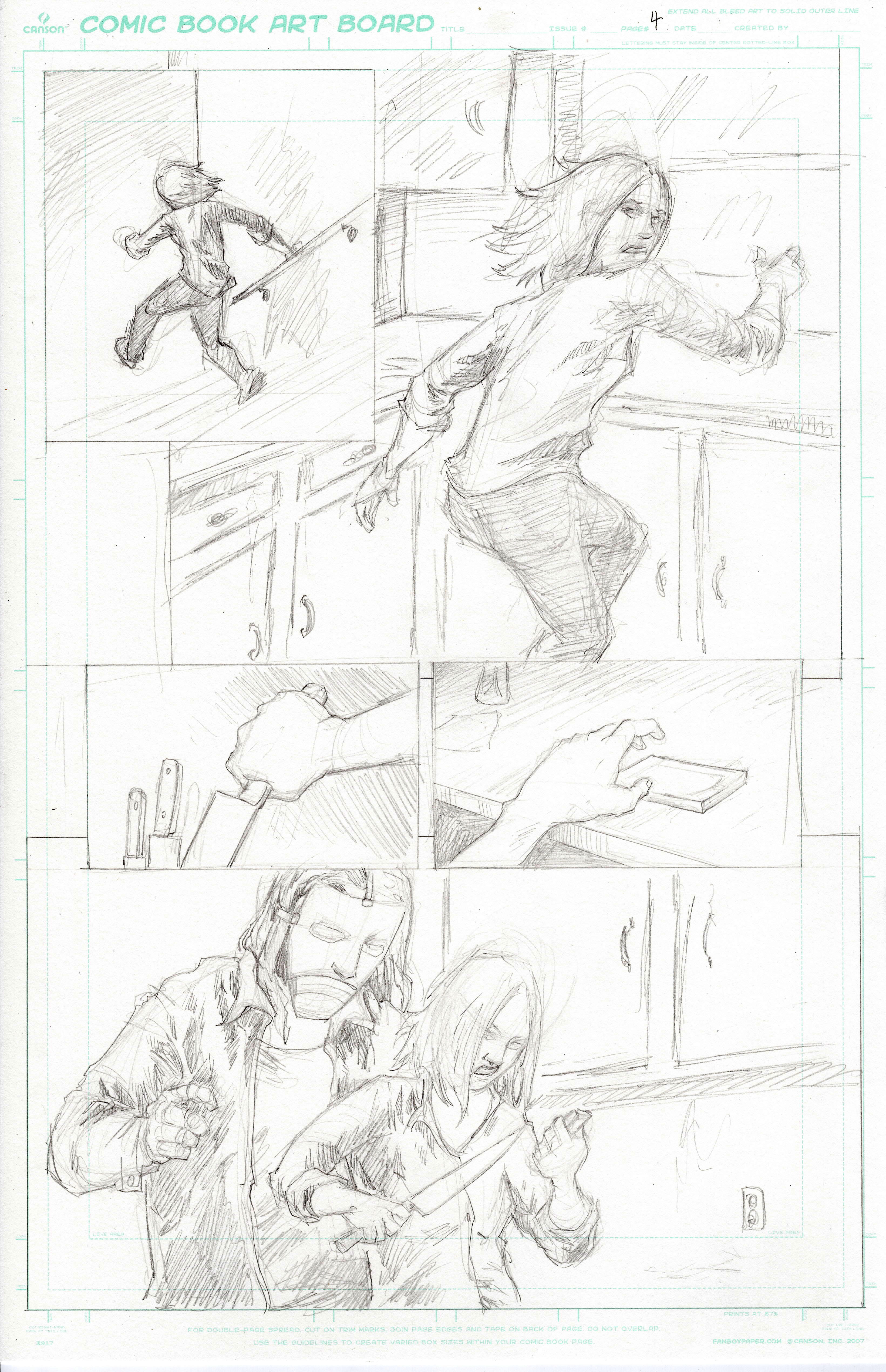
Page Summary: Five panels. Deborah makes it back downstairs to the kitchen. She grabs a kitchen knife and her phone. The Slasher reappears.
Panel 1: Small panel of Deborah racing down the stairs. This is a almost a complete reversal of panel 1 page 2.
Panel 2: Large panel, full body shot of Deborah in the kitchen. She is in mid motion – mid run. The best analogy I can give here is that Deborah’s body language is almost that of a scared cat. She is on the balls of her feet because she is essentially still in motion. She is twisted at the waist as she looks behind her to see if the Slasher is there. Her arms are in a defensive position, similar to the Heisman trophy pose. Her hands are open, fingers extended. Deborah is in full terror mode with sheer panic displayed across her face. Also, so that we know she is back in the kitchen we need to show all the items we showed just 2 pages ago (kitchen counter, microwave, sink, refrigerator, etc.)
Note: Panels 3&4 should be the same size and next to each other. The panels show two similar actions.
Panel 3: Small panel, overhead close up of Deborah’s right hand pulling a large carving knife out of a cluttered junk/utensil drawer. This is the Michael Myers variety of Carving knives.
Panel 4: Small panel, overhead close up of Deborah’s hand picking her iPhone up off the counter with her left hand.
Panel 5: Large/long panel running horizontal across the bottom of the page. This is a widescreen style shot. This is a medium close up of Deborah in profile from the waist up. Deborah has the knife in her right hand, closest to the reader. In her other hand is the iPhone. Her head is tilted down as she is focused on the phone. She is starting to dial. The rest of the frame behind her, on the iPhone/left side of her, is filled with chest of the Slasher. Deborah does not see him. He is almost on top of her. If she were to turn she would run right into him.
DEBORAH: C’mon… C’mon!
FIVE
Page Summary: Five panels. Deborah attempts to call the police. The Slasher backhands Deborah knocking the iPhone out of her hand. Deborah fights back, clocking the Slasher with a toaster.
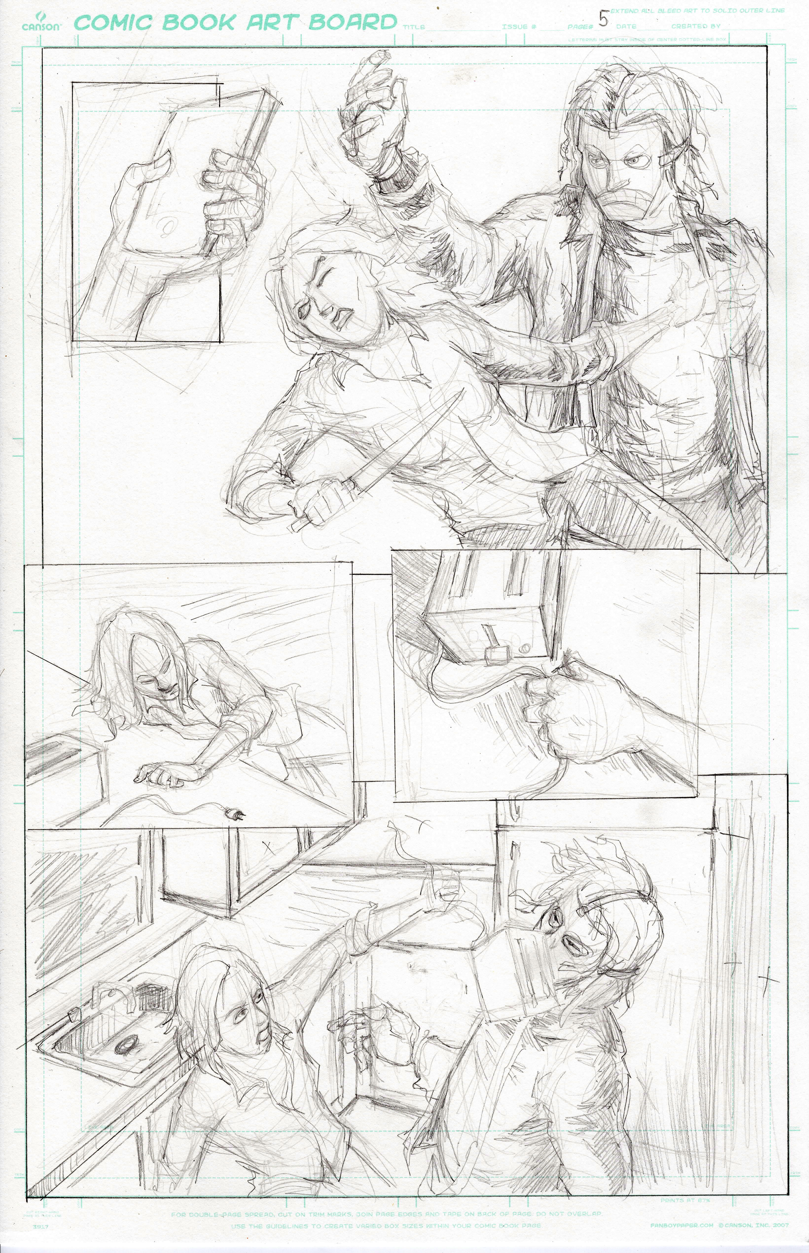
Panel 1: Extreme close up of Deborah’s left hand on the iPhone screen. We can see she has punched in the numbers 91.
Panel 2: Large widescreen style panel of the Slasher backhanding Deborah. This is a continuation of the moment from panel 5 of page four only this is an action panel. The panel should mimic scene specifics of that panel. Deborah is still closest to the reader in the panel. Now however she is in a 3/4s turn, her body twisting from the impact of the Slasher’s backhand. We can see her face is contorted in pain from the blow. The iPhone is in the air indicating that it has been knocked from her hand. The knife however is still in her other hand. The Slasher’s right arm is up, having completed the motion of the back hand. His hand should be open to indicate a backhand slap as opposed to a punch. Feel free to add action lines for emphasis if you want.
SFX: Slap!!
DEBORAH: Ugh!
Panel 3: Medium shot of Deborah who has been knocked into the counter. She still has the knife in her right hand but the phone is on the floor. There is a toaster on the counter near her. Her face is more angry than scared. She’s had enough of this.
Panel 4: Small panel, tight on the counter of Deborah’s hand on the toaster. Perhaps she is grabbing it by the cord.
Note: You may want to link panels 3 & 4 by an inset of panel 4 into panel 3. Or you may want to draw an arrow indicating the importance of the toaster in panel 4.
Panel 5: Another widescreen shot taking up the rest of the page. Again the panel is similar to panel 2 of this page and panel 5 of page four. This is another action panel. Deborah hits the Slasher across the face with the toaster. The Slasher is knocked back by the force of the toaster hitting him. You can add action lines here as well if you feel it helps emphasize the action.
SFX: Crack!!!!!!
SIX
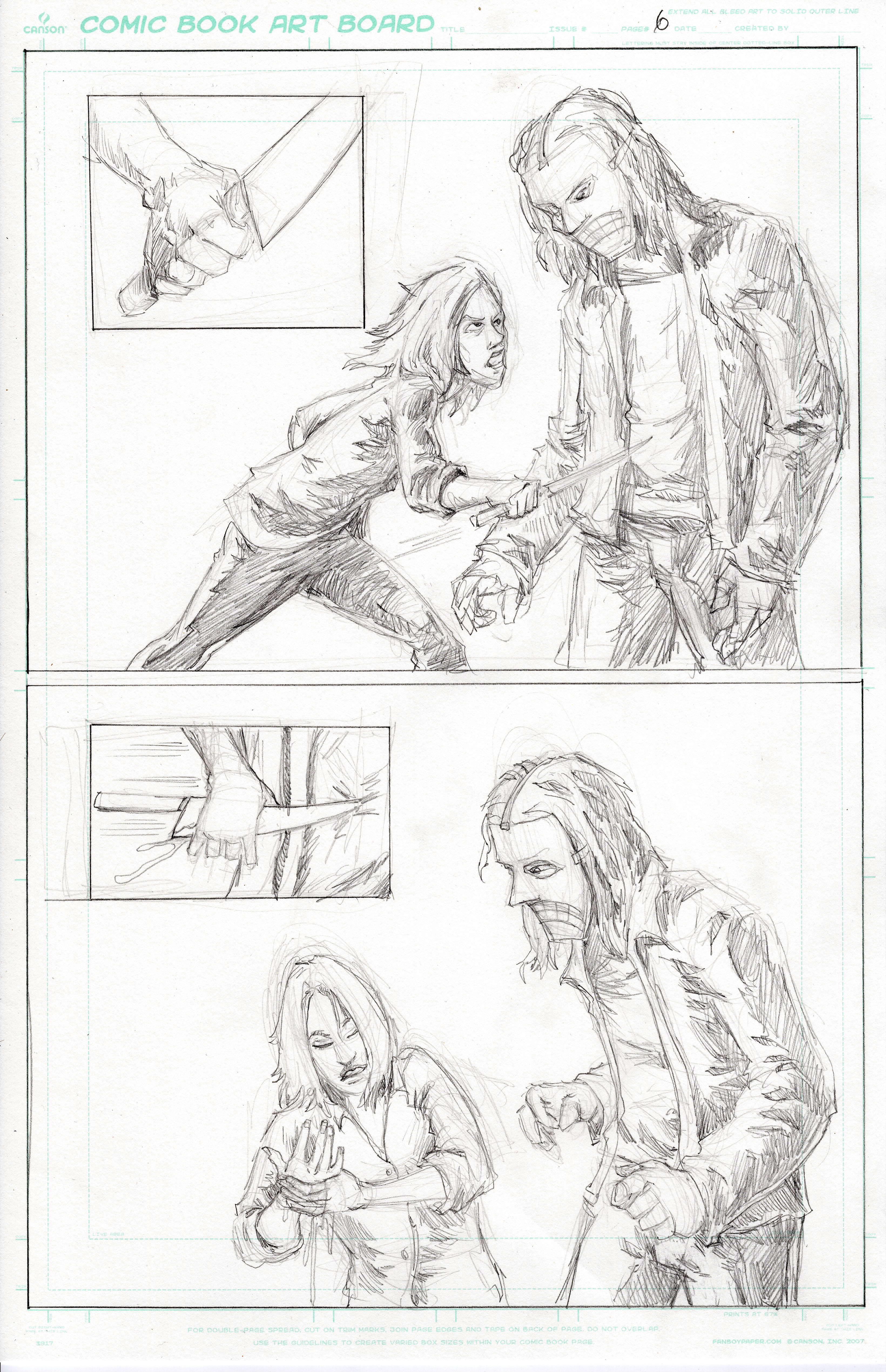
Page Summary: Four panels. Deborah stabs the Slasher but hits the body armor under his coat.
Note: The four panels on this page alternate from a small panel then to a large half page panel then another small panel followed by another large half page panel. The smaller panels can be vertical or horizontal. They do not have to mirror each other.
Panel 1: Close up of the knife in right Deborah’s hand. It is tight in her hand. The angle of the blade is aimed almost directly at the viewer. Do not draw the knife in a downward angle or in a manner that looks like it would swing down. The angle would be more of a straight stabbing motion.
Panel 2: Large half page panel of Deborah and the Slasher in profile. This is a full body shot. Deborah is (almost) stabbing the Slasher. The knife is at his stomach, an inch from his body. There should be force behind this stabbing motion. Deborah is going in for the kill here. The stabbing is going to hit the body armor so please keep the knife trajectory there.
Panel 3: Close up of the knife hitting the Slasher’s stomach. The knife is not going in. Deborah’s hand has gone gone the blade from the handle due to the body armor stopping the knife and the velocity at which she was going to stab him with.
SFX: Thunk!
Panel 4: Another large half panel page. This is a continuation of panel 2 so keep it full body. However, Deborah is now bent over as the Slasher stands unfazed. Pure agony is showcased on her face. Her body is contorted in pain as well. She is almost doubled over. Deborah is holding her right hand with the left at the wrist. Her hand is open, palm up. Deborah has sliced her hand open from the blade of the carving knife. The carving knife should be mid fall from her open hand.
DEBORAH: AAAAGGGHHH!!!!!
SEVEN
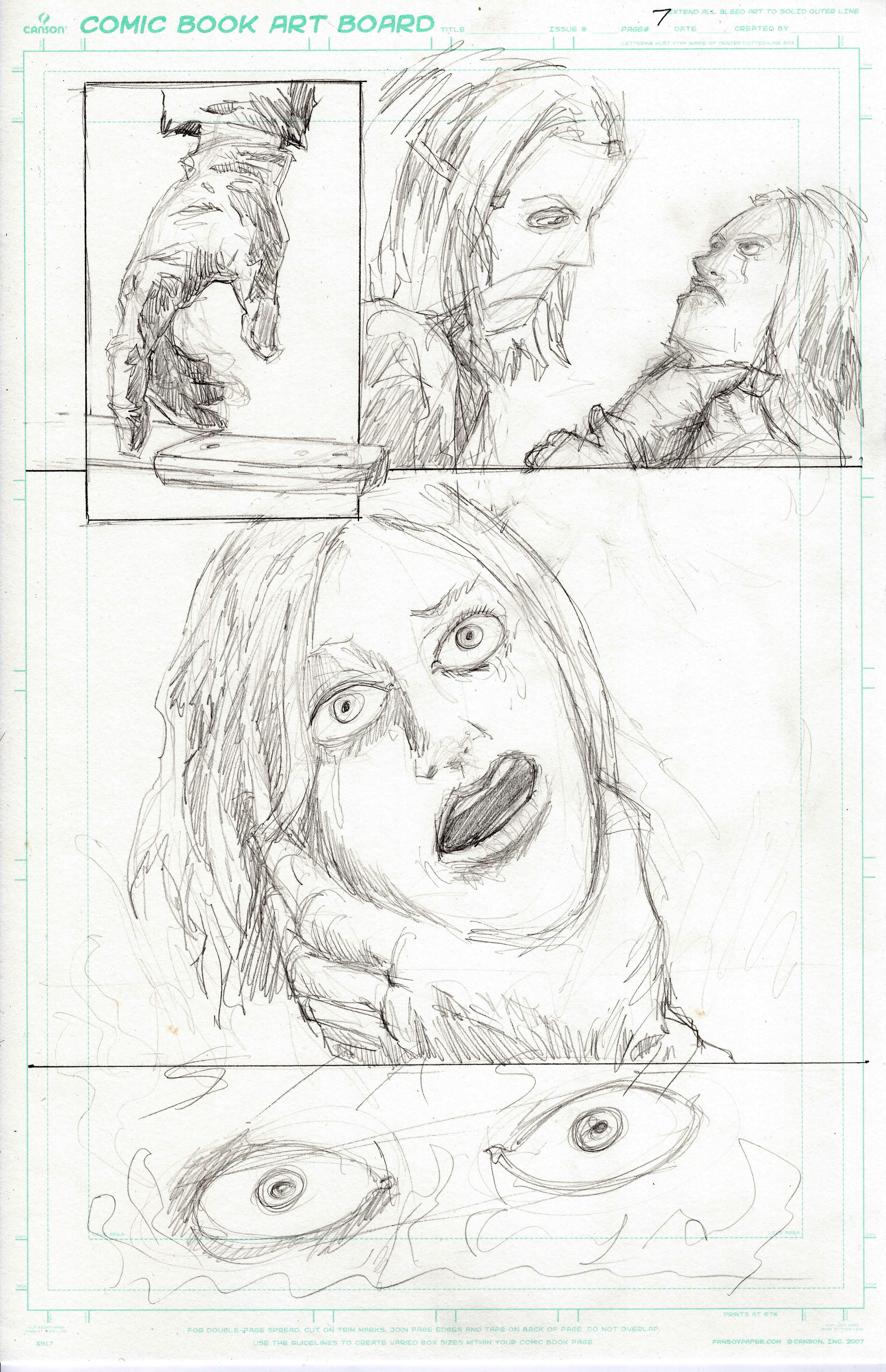
Page Summary: Six Panels. The Slasher picks up the knife and stabs Deborah.
Note: These six panels are all varying degrees of close ups. I’m leaving most of the composition and panel sizes to you. The idea is we’re getting pieces of the kill without showing the actually stabbing. Hopefully what the reader imagines is stronger than what we could show. Or at the very least the suggests a gruesome kill but doesn’t show it.
Panel 1: Close up on the the Slasher’s hand reaching to pick the knife up off the floor.
Panel 2: Tight on the Slasher’s other hand wrapped around Deborah’s neck. I see this as an over the shoulder shot or in profile from the pectoral/armpit up. This will probably be one of the larger panels on this page.
Panel 3: Close up on Deborah’s face. Her eyes are closed tightly. Her mouth is open with a quivering lip as opposed to a scream. She is quietly pleading with the Slasher. She is also in pain from the Slasher’s hands on her neck.
DEBORAH: Please… Please. Please don’t. Please. Please.
Panel 4: Close up of the knife against Deborah’s stomach. It is pointed upwards as if it were going to go into her lungs.
Panel 5: This isn’t so much a panel but a word in a panel. This should be a big sound effect – SLASH!
Panel 6: Extreme close up of Deborah’s eyes. Her eyes are wide open. Very wide. She has just been penetrated by the knife. Leave room under the eyes in the panel for more sound effects.
SFX: Slash! Rip! Slash! Rip! Slash! Rip! Slash! Rip! Slash! Rip!
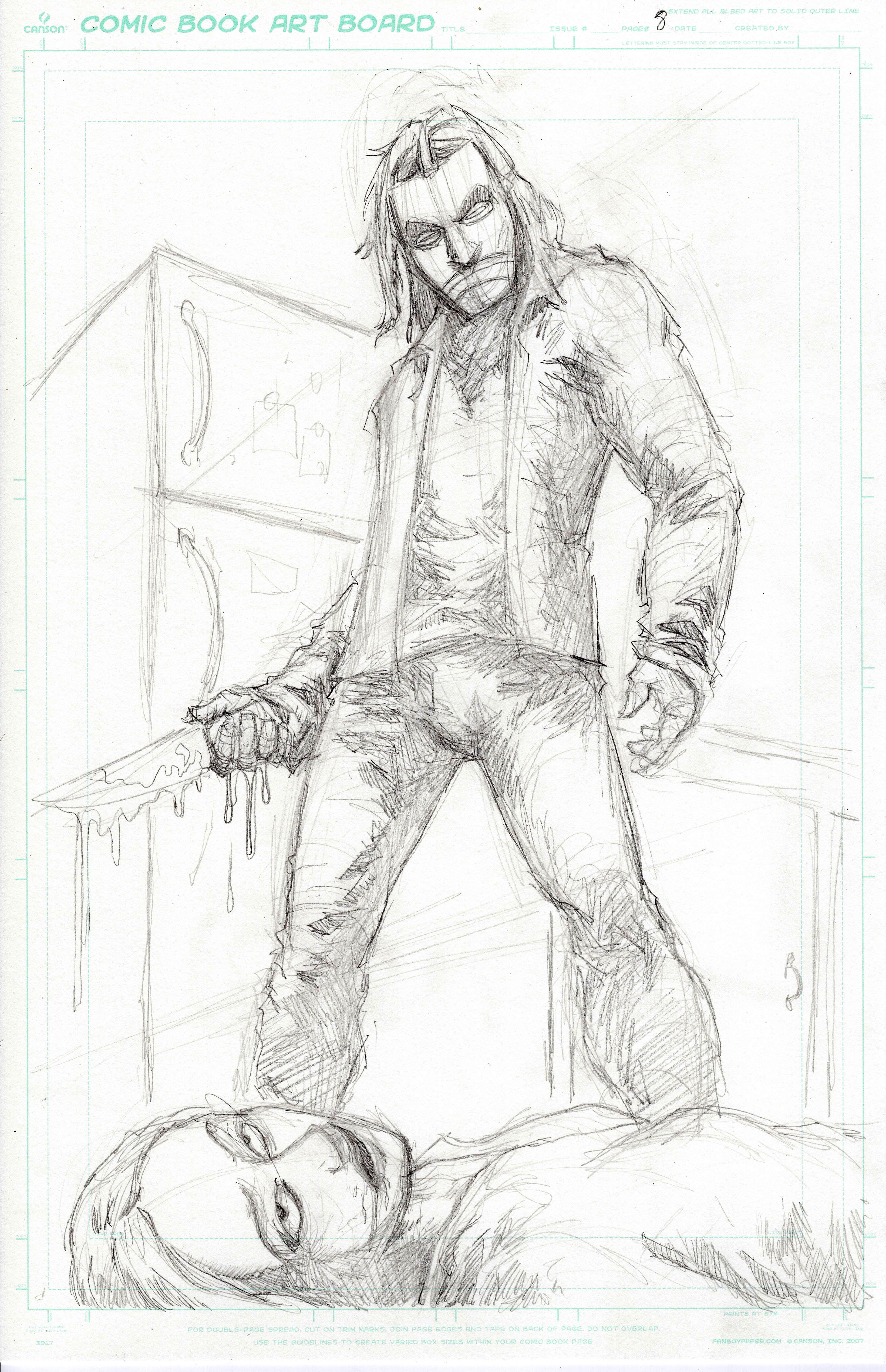
EIGHT
Splash Page: Or maybe I should say slash page… No, that’s… that’s incorrect.
This is a money shot of a splash page image. We are still in the kitchen. Deborah is now on the ground dead. The Saturday Night Slasher stands over her. He is bigger than life in this shot. This should be an iconic shot. Think Frank Miller Dark Knight Returns iconic. It’s not an action pose, but the Slasher is just standing over her corpse. The perspective should almost be from a low angle looking up, making the Slasher look even bigger. The carving knife in his hand. Deborah’s blood drips from it.